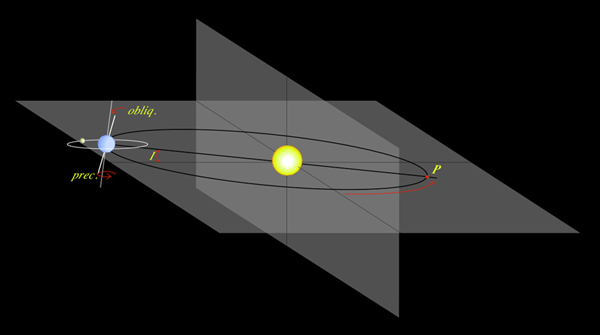
The Earth's Orbit
All the earth's energy ultimately comes from the sun. Even fossil fuels such as coal, oil and gas were once plants that obtained their energy from the sun and over millions of years of heat and pressure they have been transformed into the hydrocarbons of today.
The earth's orbit around the sun is not a perfect circle. It is slightly elliptical, about a 2% deviation from a perfect circle. This makes only a very slight difference (about 0.1% variation) in the amount of energy that hits the earth over the course of a complete orbit.
The earth is also a bit "tilted" while in orbit to the sun which gives rise to our seasons. When the northern hemisphere is tilted towards the sun, we are in summer, whereas when it is tilted away from the sun, we have winter. The angle of tilt varies from 22 to 24 degrees. In addition, the axis of rotation has a slight wobble to it which also slightly affects temperatures. In about 30,000 years, earth’s orbit will have changed enough to reduce the sunlight in the Northern Hemisphere to the levels that started the last ice age.
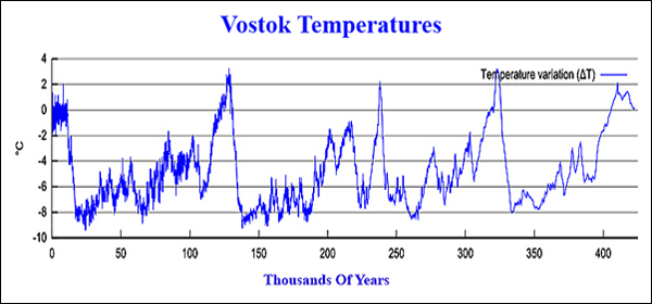
As the Vostok temperature plot to the left shows, there is a cycle to the data of approximately 100,000 years. For a detailed Vostok discussion click here. There is about a 10,000 year fast warming period prior to each peak. Then there is a slow 90,000 year cooling slide before the next warming cycle begins. Along the way down there are some minor cycles of significance.
In the 1930's long before the Vostok data was compiled, a Serbian Engineer, Milutin Milankovitch, calculated how the gravitational pull of the sun, moon, and planets would affect the earth's orbital rotation and angles to the sun. He found that the shape of the earth's orbit around the sun and the inclination of the earth's axis oscillate gently in cycles lasting thousands of years. In particular, he predicted that the gravitational pull of the planets (especially Juniper) would cause the earth to have a periodic "enlarged orbit" every 100,000 years. He also found that the "inclination" (angle of rotation axis) that varies from 22 to 24 degrees would have a 41,000 year minor cycle and that the wobble of the rotation axis would create an additional minor cycle about every 21,000 years.
In the 1950's after radiation carbon dating became common, the Milankovitch 21,000 and 41,000 year cycles were tentatively confirmed from the study of sea shells buried in the ocean floors. Then in the 1990's, the deep Vostok core samples definitely confirmed the 100,000 year cycles. using standard statistical techniques, these major and minor cycles can be easily seen in the Vostok data. So the "take away" conclusion is that the major cycles in our climate in the past 400,000 years have been caused by astronomical events rather than by carbon dioxide swings. Although, we will see later that carbon dioxide patterns accelerate the swings, especially on the upside. Top
Recent Satellite Temperatures Show A Steady Increase
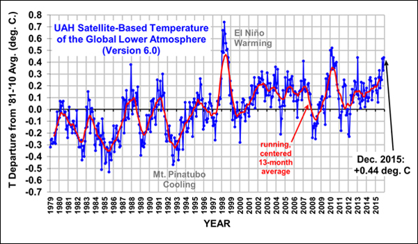
The University of Alabama Huntsville (UAH) satellite temperature 40 year data set calculates the temperature of the atmosphere at low levels from a number of different satellites by measuring radiance. Satellites do not measure temperatures directly. They measure radiances in various wavelength bands, from which temperatures can then be calculated. The algorithms are very sophisticated, not just averaging a few data points.
The satellite data is very broad covering 97% of the earth's surface and very timely. However, in the 1990s there were some discrepancies, when UAH data sets were compared with ground data sets, due to the satellites drifting somewhat lower over time. These and other minor issues have been compensated for in the current calculations.
The chart to the left above shows that temperatures peaked in 1998 due to a severe El Nino warming and again in 2016. Overall the 40 year temperature trend has been a steady increase even if the 1998 El Nino and 2016 data points are ignored. This is consistent with other ground based temperature measurements. Top
Sunspot Cycles Indicate The Sun's Activity
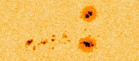
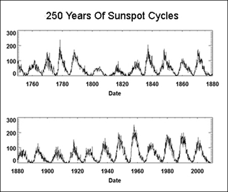
The sun's activity does have an affect on the earth's temperatures and can be measured by "Sunspot counts". See the Sunspot example at the left. Daily Sunspot counts have been accurately recorded since their initial observations by Galileo in the early 1600's. See the historical 397 year chart below. However it was about 150 years later that Samuel Schwabe, after 17 years of observations, observed the cyclical pattern in the Sunspots and that the Sunspot Cycle length was approximately 11 years.
In the modern age, a large number of counts from all over the world are reported and are averaged each day. However, when looking at Sunspot counts over hundreds of years of data, the daily counts are usually averaged into a monthly number to keep the graphs manageable.
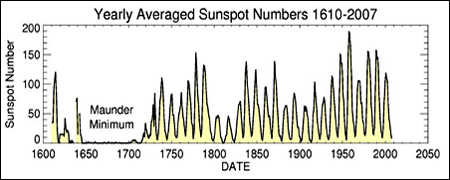
One of the great Sunspot mysteries is the Maunder Minimum which lasted 70 years starting about 1650. Sunspots were rarely observed during this period but this was not for the lack of attention. Accurate records were kept, even though the cyclical nature was not yet known. For reasons not understood, the cycles revived themselves around 1750 and have continued ever since in their 11 year average period (actually 10.7 years to be exact).
Starting in 1755 sunspot cycles have been numbered so that they can be referred to easily. The monthly daily average number of Sunspots increases from almost zero to over 100 and then decreases to near zero as the next cycle begins.
In 1919 George Hale demonstrated that the Sunspot Cycles coincided with the sun's magnetic cycles. However the magnetic cycle is a 22 year cycle, double the 11 year Sunspot Cycle.
It is now believed that the criss-crossing of huge "magnetic fields" in the sun's plasma Convection Zone just beneath the surface causes Sunspots to form.
These disturbances form zones of lower surface temperatures which appear dark. However, these spots are not really dark, but quite bright. They appear dark only when compared to excessively bright areas nearby. For more Sunspot information, see the Sunspots Cycles Page.
Sunspots are in general a good measure of the sun's internal activity. Tall thin cycles indicate that the sun is in a very active cycle. When the sun is active the surface has many Sunspots, Flares, Prominences, and Coronal Mass Ejections (CMEs). Short fat cycles indicate the sun is in a "cooling" cycle.
Sunspots themselves have no influence on our climate, they are just an indicator. However, the accompanying activity of Flares, Prominences, and CMEs do influence the earth's climate.
For an interesting short video of a complete sunspot cycle, see the NASA Cycle 23 Video. Top
During Prolonged Sun Inactivity - Temperatures Dip
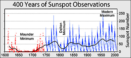
Most researchers are convinced that the Maunder Minimum, from 1650 to 1725 (shown at the left), was the ultimate cause of the Little Ice Age that occurred on earth at the same time. This was the first direct evidence that the sun's variations had a significant influence on the earth's climate.
The Dalton Minimum was named after John Dalton who was a famous physicist and meteorologist in the early 1800's. The "cool period" from 1790 to 1830 was named after him after he correlated the sunspot cycle's low period to the earth's then cooler temperatures. Top
Recent Sunspot Activity
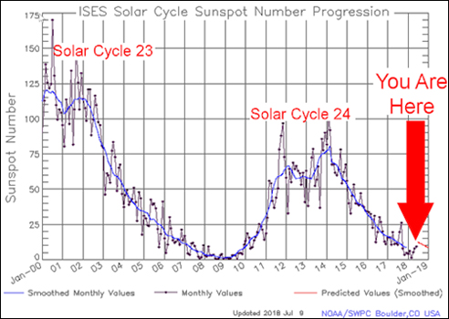
Current sunspot cycle number 24, which began in 2009, is a "small" one with a "smoothed" peak number of about 77 in 2014. Many cycles are double peaked but this is the first in which the second peak in sunspot number is larger than the first. We are currently about 9 years into Cycle 24. The current peak makes Cycle 24 smaller than Cycle 14, which had a maximum smoothed sunspot number of 107 in February of 1906.
Small sunspot cycles mean the earth is going through a "cooling period" period as far as the influence from the sun is concerned. (See the "Dalton Minimum" above during the Revolutionary War with Briton. Remember how cold it was at Valley Forge for George Washington and his troops.) On the other hand, today we have major global warming effects from "greenhouse gases" tending to warm the atmosphere.
It takes a few years for the cooling effects from the sun to take hold because of the heat retention ability of our oceans. Based upon magnetic field measurements 120,000 miles beneath the sun’s surface by NASA and the University of Arizona, Cycle 25 whose peak is due around 2024, will be weaker still. Therefore the next decade will be very interesting. What conditions will dominate - the sun's cooling or the greenhouse gases warming?
Sunspots Correlate With Cosmic Rays
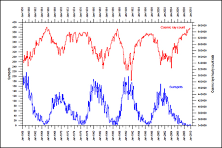
Sunspots have a pretty good inverse relationship with cosmic rays. That is, when sunspots (blue data in the chart to the left) are high, cosmic rays (red data) are low, and vice versa. A paper by Jasper Kirby, a British CERN scientist, explains the mechanisms that translate sunspots into local weather:
-
Strong sunspot cycles indicate a very active sun which makes for a strong solar wind.
-
A strong solar wind decreases the amount of outer cosmic rays that enter the earth's atmosphere by increasing the number of cosmic ray collisions in outer space.
-
Cosmic rays induce cloud formation in the earth's atmosphere. Fewer cosmic rays result in less heavy cloud cover.
-
Less heavy cloud cover allows more sunlight to reach the earth which increases the earth's warming.
-
Net-net: An active sun induces earth warming, while inactivity induces cooling. Almost self evident, isn't it.
That cosmic rays actually cause clouds to form has been confirmed by the "SKY Experiment" at the Danish National Space Center. However, much work needs to be done to fully understand the process. Top
Cosmic Rays And Clouds
The "direct" effects from the sun's luminosity variations (per the 11 year cycle above) result in very small changes in the earth's average temperature (about 0.1°C). Yet there is ample evidence from years past, such as the Maunder and Dalton Minimums, that when the sun goes inactive, earth's temperatures cool.
Many scientists have concluded that there must be a secondary "amplifier" in the climate system that multiplies the small changes in the sun's activity into much larger temperature swings. The current leading candidate to be the "amplifier" is cloud cover induced by cosmic rays.
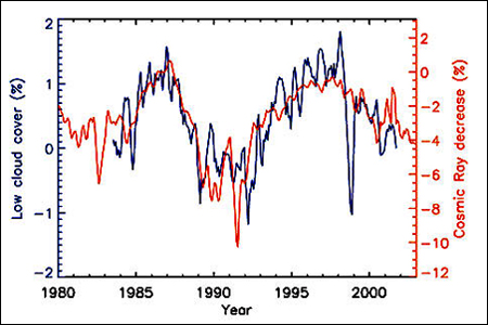
As shown in the chart at the left, low cloud cover is highly correlated with cosmic ray fluctuations.. The chart is from a paper by Nir Shaviv, professor of astrophysics, Hebrew University, Jerusalem, entitled Cosmic Rays and Climate. When the air is highly saturated with water vapor, the water's preferred phase is to be in the liquid state. However, in order for the water vapor to condense, it must have a solid surface to adhere to. This surface can be tiny dust particles, salt crystals, or other small particles (called aerosols).
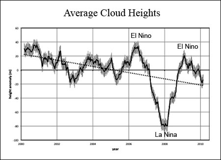
Roger Davies and Mathew Molloy, of the University of Auckland, in a recent paper indicate that average global cloud heights have decreased from 2000 to 2010 as measured by the Terra satellite and were the result of the sun becoming inactive as part of Sunspot Cycle 23 closing down (less sun activity = more cosmic rays = more clouds). See the chart to the left.
According to the Davies and Molloy paper, the increased cooling effects from the lower cloud heights during the past 10 years have more than offset the positive effects from an increase in greenhouse gases from human activities. They explain that this is the major reason global warming has essentially been flat during the last 10 years.
Smaller particles (aerosols) make whiter longer lasting clouds. The whiter the better as far as reflecting sunlight is concerned (which induces cooling). In clean environments, like in the middle of an ocean, the primary source of aerosols is nucleation, which is a process whereby new solid particles form from atmospheric gases.
These newly created particles are just a few nanometers in size and must continue to grow through coagulation to several tens of nanometers before they can act as seeds for cloud formation. Sulfuric acid (H2SO4) is the main trace gas responsible for nucleation in the atmosphere. In addition, experiments confirm that ammonia molecules also greatly enhance the outcome of the process.
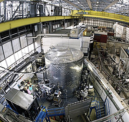
The CLOUD Project at CERN in Switzerland headed by Jasper Kirby (mentioned in the section above) is using the Proton Synchrotron to simulate cosmic rays, which are 90% hydrogen protons. CERN has built a special chamber for experiments utilizing various atmospheric gas combinations to understand the nucleation process in detail. The atmospheric chamber is the cylinder wrapped in silver in the center of the photo at the left.
Current climate computer models do not simulate the effect of cosmic rays and clouds very well as this process is not well understood at the atomic level.
It is the goal of the CLOUD Project to increase our knowledge of the nucleation process such that this knowledge can be incorporated into future models and forecasts. Visit the CLOUD to learn more about the project. Top
Milky Way Cosmic Rays
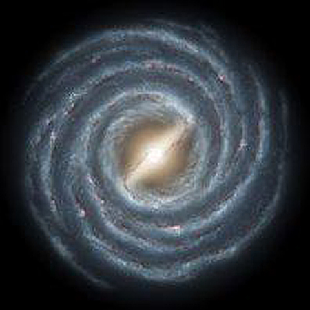
Shown at the left is an artist's conception of our Milky Way. Note the rotating spiral arms. The density of cosmic rays increases at the centers of each of the spiral arms. This is because cosmic rays originate mainly from the explosions of supernovas which form and die in the spiral arms. Our solar system crosses one of these spiral arms approximately once every 135 million years. As we pass through the arms, the density of cosmic rays increases and then decreases which causes the earth to cool and then re-heat on a very long time cycle.
Temperatures have been reconstructed over a 550 million year time scale by Jan Veizer, a partner of Nir Shaviv, by looking at oxygen isotope ratios found in fossils from deep tropical oceans. Shaviv had also constructed a very long term cosmic ray record by studying the remains of iron meteorites. He then combined his cosmic ray record with Veizer's temperature record into a multi-million year cosmic ray and temperature link. The correlation between cosmic rays and temperatures can explain more than 2/3's of the variance in the long term temperature history. Said differently, cosmic ray variability is the "dominant" climate driver over the many million-year time scales. CO2 and other variables make up only 1/3 of the climate variance.
Please note that Shaviv/Veizer exercise had nothing to do with our sun. The results are completely independent of the sun's modulation of cosmic rays. The cosmic rays from the spiral arms stand on their own. Therefore, if cosmic rays were the major driver of climate in ancient times, should they not also be a major influence today? Shaviv believes cosmic rays modulated by the sun's activities in today's environment account for 1/2 to 2/3's of the climate's variability. He concedes that humans are most likely responsible for the other 1/3 to 1/2.
In summary, if the earth's climate is influenced primarily by the sun (albeit indirectly), we are in for an extended cooling period for a few decades, or at least a continued slide sideways. However, as will be shown below, there is another contingent of the scientific community that believes that the greenhouse effect will outweigh the sun's influence. (Also remember that the earth's climate "at any time" can be cooled for a few years by the release of large amounts of ash and other particles into the atmosphere by a very active volcano. However, volcanoes have been more or less silent recently.) Top
The Greenhouse Effect
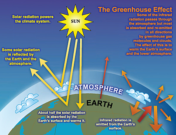
Overview. The chart at the left shows the basic Greenhouse Effect. The average location on earth receives 342 watts per square meter (w/m2) of incoming radiation at the upper edge of the atmosphere (more at the equator, much less at the poles). About 26% is reflected back into space by clouds and the atmosphere. Another 4% is reflected back into space by the surface of the earth. Finally, an additional 19% is absorbed by clouds and the atmosphere. That leaves 51% to be absorbed by the earth's surface.
The earth then radiates energy back into the atmosphere through infrared radiation (relatively long wave radiation). A small amount, 17%, gets radiated back from the earth directly into space, but the balance, 87%, is radiated into the atmosphere and absorbed by clouds and greenhouse gases. The heat is then re-radiated by greenhouse molecules and clouds in all directions including some back to earth and some into outer space. It is the heat portion that gets reflected back to earth that keeps the earth a comfortable place for life. They are called "greenhouse gases" because they hold heat in, like the glass ceilings of a greenhouse. (One can think of them as a thin invisible summer blanket. Most of the heat is trapped and returned to earth, but some does escape to outer space.)
If the only source of heat had been the incoming sun's energy, the average temperature at the earth's surface would be -0.4 °F (-18 °C). However, the actual average temperature is +57.2 °F (+14 °C). The difference of +58 °F (+32 °C) is due to the Greenhouse Effect and makes life here on earth much more enjoyable. Naturally occurring greenhouse gases are a blessing! However, if there were too much of the greenhouse gases, earth would be like Venus, where the greenhouse atmosphere keeps temperatures around 400°C (750°F).
Greenhouse Gas Composition. 99% of the earth's atmosphere is made up of nitrogen and oxygen. Neither of these two gases absorbs infrared radiation so they are not part of the greenhouse effect. The greenhouse gases are trace gases: water vapor (H2O, 36% to 70%), carbon dioxide (CO2, 9% to 26%), methane (CH4, 4% to 9%), ozone (O3, 3% to 7%) and a few other minor gases. In total they make up less than 1% of the atmosphere. The other "non-gas" major contributor to the greenhouse effect is clouds. Clouds absorb and emit infrared radiation and have a large effect on the radiative properties of the atmosphere.
The atmosphere is transparent to the shorter wavelengths of incoming light (the visible and high frequency ultraviolet spectrums) so most of the incoming energy strikes the earth. The balance of the incoming energy, the 19%, is "long wave" and is absorbed by the atmosphere. The earth absorbs the "short wave" transparent energy from the sun, but when it re-emits the energy back into the atmosphere, most of it is "long wave" radiation which is not transparent to greenhouse gases.
The greenhouse gases are all molecules composed of "more than two" atoms loosely bound together. Their key characteristic is that they vibrate when they absorb heat. The major atmospheric gases, nitrogen (78%) and oxygen (21%), are only "two atom" molecules too tightly bound together to vibrate. Therefore they do not absorb heat and hence they are transparent to incoming and outgoing energy. Top
Detailed Radiation Budget
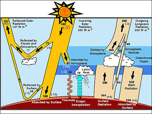
All bodies above absolute zero (-273°C) radiate heat. If the body is warm enough it glows, like the burner on an electric stove, as it radiates heat. Our sun and the earth are no exception, they both radiate heat. The illustration at the left is a detailed description of the radiation cycle from the sun to the earth and back again into outer space. The "solar constant" is the average radiation per square meter from the sun at the upper edge of the atmosphere. It varies somewhat due to the non-circular (elliptical) orbit of the earth around the sun. On average the solar constant is 1368 watts per square meter (w/m2).
At the equinox (in March and September) the sun shines for only 12 hours a day, so we need to divide the solar constant by 2 as part of calculating an average. Likewise the average latitude is 45 degrees, half way to the poles, so we must divide by 2 again. Therefore the average amount of radiation seen by the average earthly location is 1368 divided by 4, which equals 342 w/m2 as shown next to the sun in the chart at the left.
In the upper left hand corner one can see that 107 w/m2 is immediately reflected back into space by clouds, the atmosphere and the surface of the earth. 342 (total incoming) minus 107 (reflected) is 235 w/m2 that is "absorbed" by the atmosphere and earth. Notice that in the bottom center of the chart 24 w/m2 is radiated back into the atmosphere by thermal radiation. In addition 78 w/m2 is returned to the atmosphere by evaporation. Add 24 (thermal) plus 78 (evaporation) plus 67 (incoming) and 350 (surface radiation) equals 519 w/m2 total input to the greenhouse gas section of the atmosphere. Take 519 (total to greenhouse) - 324 (back to earth radiation) + 40 (direct earth to space radiation) equals 235 w/m2 outgoing radiation back to space. 235 w/m2 of outgoing radiation equals the amount of incoming absorbed radiation, so this chart illustrates an earth in radiation balance. Note that the 324 w/m2 that is radiated back to earth a second time is critical to life here on earth as it keeps our average temperature about 57°F (14 °C) which is very comfortable for humans and other species.
The above equilibrium situation means the earth's temperature would always be a constant. If there were to be an imbalance, say more "incoming" radiation, then the earth's temperature would increase until its outward radiation again balanced the input. The same is true if the "outgoing" radiation was increased, the the earth would then cool until the incoming/outgoing radiation was again in balance. This relationship is not linear, it takes a 4% increase in radiation input to get a 1% increase in absolute temperature. Top
The Carbon Budget
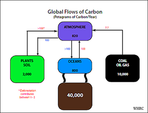
Why all the interest in carbon? Humans, as well as all of the plants and animals on earth, are primarily made of carbon. About 50% of our dry weight is carbon. In addition, carbon dioxide is the key ingredient of greenhouse gases which are heavily involved in the warming of our planet.
As can be seen from the chart at the left from the Woods Hole Research Center (WHRC), the "natural" flows of carbon to the atmosphere from plants and soil as well as the oceans are thought to be pretty much in balance as we currently understand them. (The global rates of photosynthesis and respiration are neither well known nor measured well per the Woods Hole team.) However, what is well known is the amount of carbon that humans are putting into the atmosphere, which is 7.7 petagrams (Pg) of carbon a year (one petagram equals one billion metric tons).
The total amount of carbon in the ocean and ocean sediments is about 50 times greater than the amount in the atmosphere. The flow (flux) of carbon dioxide between the atmosphere and the ocean is a function of wind speed and the concentration difference of carbon dioxide in the air and water.
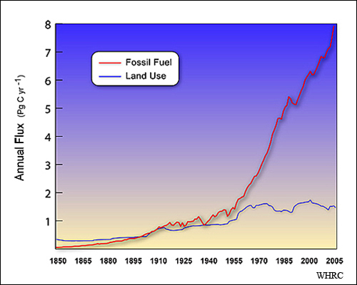
Carbon dioxide ocean solubility is a function of sea surface temperature and salinity. Ocean carbon is exchanged with the atmosphere on a time scale of hundreds of years. Most of the increase in atmospheric CO2 concentration has come from the use of fossil fuels (coal, oil, and natural gas) for energy, but more than 30% of the increase over the last 150 years came from changes in land use. See the flux (flows) chart at the left.
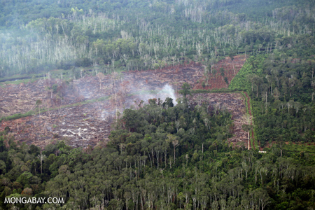
The land changes are primarily from the clearing of forests for food production. Human clearing of forests for croplands is relatively well documented as well as observations from satellites. This data can also be used to determine the storage of carbon on land.
WHRC’s work shows that between 1850 and 2005, about 156 Pg of carbon was released into the atmosphere from changes in worldwide land use and the recent rate of release averaged about 1.5 Pg of carbon per year.
In summary, the average annual fluxes (in Pg) for the period 2000 to 2008 were: emissions from fossil fuels (+7.7) plus emissions from land use (+1.5) minus ocean intake (-2.3) minus net plant/soil intake (-2.8) equals the yearly atmospheric increase (+4.1). Top
How Does Carbon Dioxide Influence Temperatures?
Carbon dioxide makes up about 20 percent of earth’s greenhouse gas content; water vapor accounts for about 50 percent; clouds account for 25 percent, and the balance are very minor gases such as methane and some aerosols (tiny particles).
The amount of water vapor in the air is controlled by the earth’s temperature. Warmer temperatures cause more water to be evaporated from oceans, lakes and land. Cooling causes water vapor to condense and fall out as rain, sleet, or snow. Carbon dioxide remains a gas at a wide range of atmospheric temperatures, much more so than water vapor which condenses when cooled.
Carbon dioxide provides the basic greenhouse gases the temperature margins needed to sustain water vapor in the greenhouse layers. When carbon dioxide amounts drop, some water vapor falls out of the greenhouse gases and atmospheric temperatures drop. Likewise, when carbon dioxide concentrations in greenhouse gases rise, more water vapor is stored in the greenhouse gases causing yet more atmospheric heating. Thus carbon dioxide "amplifies" the greenhouse heating and cooling effect.
So while carbon dioxide contributes less directly to the overall greenhouse content than does water vapor, climate scientists believe that carbon dioxide is the gas that ultimately "regulates" the earth's temperatures. This is how a very small atmospheric component, 0.4% carbon dioxide, can have an enormous affect on our climate. While the ultimate long term temperature direction is determined by the sun/earth relationship, once initiated, carbon dioxide "accelerates" temperature movements either upwards or downwards.
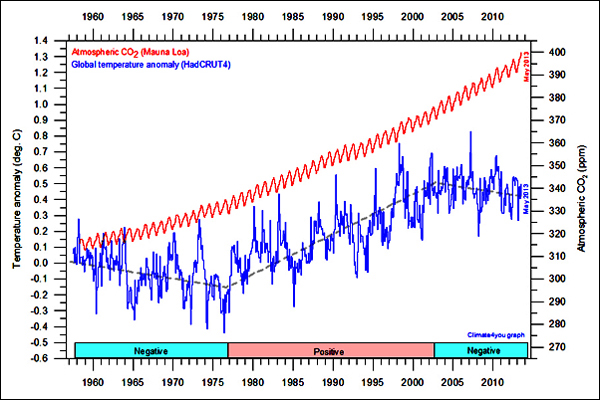
While virtually all scientists agree there is a very high correlation between carbon dioxide levels and temperatures, not all are convinced of the cause and effect relationship. The graph to the left (courtesy of climate4you.com) illustrates the issue. CO2 (in red) has been increasing steadily for the last 50+ years as measured at the Mauna Loa Observatory in Hawaii, considered the last word in CO2 measurements.
While world temperatures have been rising, the correlation with carbon dioxide has not been perfect. Shown in blue are the worldwide average temperatures as reported in the HadCRUT4 data set. HadCRUT4 is the data set of monthly records formed by combining the sea surface temperatures compiled by the Hadley Centre of the UK Met Office and the land surface air temperatures compiled by the Climatic Research Unit (CRU) of the University of East Anglia. HadCRUT4 is considered the last word in surface measurement temperatures.
A "minority" of climate scientists believe that temperatures control the carbon dioxide levels rather than the other way around. They also believe temperature movements are predominately the result of purely "natural" causes not yet fully understood. Their argument is somewhat supported by data. The above chart shows that while the atmospheric CO2 content was steadily increasing in the 1960s and early 1970s, average temperatures were dropping. In fact some climatologists were worried that we were entering another ice age. About 1977 temperatures began rising again and continued rising until about 2004. Since 2004 average surface temperatures have been dropping slightly even though the CO2 content continues to increase. It is too early to tell if this is just a minor downturn or a genuine trend. The author's guess is it is just a minor correction which will resume its upward trend when sunspot cycles pick up again. Top
Burning Contributes 18% of CO2 Emissions
Stanford University Professor Mark Jacobson's research, published in a paper July 30, 2014 in the Journal of Geophysical Research, is based on a three dimensional computer simulation of the impacts of biomass burning. His findings indicate that biomass burning is playing a much bigger role in climate change and human health issues than previously thought. Biomass burning includes wildfires, clearing forests, burning other vegetation, and industrialized biomass burning for energy production. Jacobson determined that 7% of of total biomass burning can be attributed to natural wildfires and 93% to human causes.
Jacobson, the director of Stanford's Atmosphere/Energy Program, explains that total human created carbon dioxide emissions excluding biomass burning, is about 39 billion tons annually. That incorporates everything associated with non-biomass burning human activity, from coal-fired power plants to automobile emissions, and from concrete factories to cattle feedlots. Jacobson says that 18 percent (8.5 billion tons) of all atmospheric carbon dioxide emissions (47.5 billion tons) comes from biomass burning. "We calculate that 5 to 10 percent of worldwide air pollution mortalities are due to biomass burning," Jacobson said. "That means that it causes the premature deaths of about 250,000 people each year."

However, the total warming impact of biomass burning is actually greater than the above figures show. Jacobson's research demonstrates that it isn't just the CO2 from biomass burning that's the problem. Black carbon and brown carbon maximize the thermal impacts from such fires. They essentially allow biomass burning to cause much more global warming per unit weight than other human associated carbon sources. Black and brown carbon particles increase atmospheric warming by entering the minuscule water droplets that form clouds. When sunlight penetrates a water droplet containing black or brown carbon particles, the carbon absorbs the light energy, creating heat and accelerating evaporation of the droplet. This causes the cloud to dissipate. And because clouds reflect sunlight, cloud dissipation causes more sunlight to reach the earth, resulting in warmer ground and air temperatures. Also Jacobson added, "carbon particles released from burning biomass also settle on shiny snow and ice further contributing to global warming".
Jacobson noted that some carbon particles - specifically white and gray carbon, can exert a cooling effect because they reflect sunlight. That must be weighed against the warming qualities of the black and brown carbon particles and CO2 emissions generated by biomass combustion to derive a net effect. Over a 20 year period, he found that biomass burning raises global temperatures 0.4 degrees Celsius even after accounting for the cooling effect of the white and gray carbon. Factoring in the effects from all other greenhouse gases, global temperatures are predicted to rise about 0.9 degrees Celsius in 20 years. Jacobson says "The bottom line is that biomass burning is neither clean nor climate-neutral. If you're serious about addressing global warming, you have to deal with biomass burning as well." Top
The Great Ocean Conveyor Belt
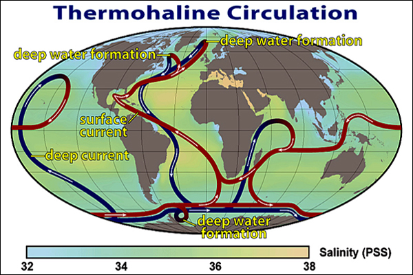
The term thermohaline comes from "thermo" referring to temperature and "haline" referring to the salt (saline) water content, the factors which together determine the density of sea water. The Thermohaline Circulation (THC) is also called the "Great Ocean Conveyor Belt". It is one continuous river-like current that travels the world oceans (there is only one body of water) both on the surface and down into the very deep waters making a huge complicated loop. It is driven by both temperatures and salt content. Cold water is more dense than warm water and will sink to the bottom of the ocean. The same is true of salty water, it is more dense and it too will sink. The trip around the world is very, very slow. It takes from 1,000 to 2,000 years to make the round trip.
The great conveyor is triggered by the deep cold water masses in the North Atlantic and the Antarctic Oceans. In the deep ocean, the driving force is the difference in density caused by salinity and temperature (the more saline the denser, and the colder the denser). The density of ocean water is not homogeneous, but varies significantly. Sharply defined boundaries exist between water masses which form at the surface and subsequently maintain their identity within the ocean. Notice the ocean coloring in the map above. Blue indicates light salinity, green average, and yellow heavy salinity (and density).
Water masses position themselves above or below each other according to their density. Warm seawater expands and is thus less dense than cooler seawater. Saltier water is denser than fresher water because the dissolved salts fill in between water molecules resulting in more mass per unit volume. Lighter water masses float over denser ones (just as a piece of wood or ice will float on water). In order to assume their most stable positions, water masses of different densities flow providing a driving force for the currents.
Our discussion of the flow of the great conveyor belt begins between Greenland and Iceland in the North Atlantic Sea. See the "deep water formation" at the very top of the above map. Cold, dry winds blowing across northern Canada chill the ocean surface waters. In addition, water evaporation, and sea ice formation all leave behind cold, salty, dense water. The cold, salty water sinks, overturns, and begins to flow southward. It flows south along the slopes of North and South America towards Antarctica. As it bends around South Africa some currents branch off to the Indian Ocean while the rest continue around Antarctica and up into the Pacific Ocean. These deep currents gradually warm and mix with upper level waters as they cross the equator and flow north in the Pacific Ocean.
After rising to the surface in the Northern Pacific, the surface waters bend around and flow southwest through the Indonesian islands and northern Australia into the Indian Ocean. Eventually they join up with the currents from the Indian Ocean and flow back around South Africa. After entering the Atlantic Ocean, the surface waters join up with the wind driven currents in the Atlantic becoming saltier from evaporation due to the intense tropical sun. The currents then become known as the Gulf Stream as they travel up the eastern coast of the US and back across the Atlantic to warm Northwestern Europe. As they flow further north back to Greenland they loose most of their heat. They become cold and very salty and once again begin their deep, overturning dive. Top
When The Great Conveyor Shuts Down
There is evidence in the Greenland ice cores that from time to time the "great conveyor" shuts down. Using ice core evidence and computer models, scientists have formulated the following scenario. The salty Gulf Stream water heads north and as it approaches England and Northern Europe it heats up the air bringing unusually warm weather to that latitude and the water then cools accordingly. If the surface water picks up enough fresh water from melting sea ice and glaciers as a result of warming, it will become less salty. Warmer temperatures also bring more rain and river run off so the new fresh water also dilutes the salt water making it less dense. Eventually in the Greenland area the northern sea water loses most of its density and refuses to sink. It just mixes with the local surface waters.
At this point there is no current and the great conveyor simply shuts down. However, the warm atmosphere continues to bring on more fresh water, but now it has no where to go. It puddles on the surface and may freeze into more ice during winter. (Somewhat salty water does freeze but at a lower temperature than fresh water.) The great current is not easily started up and may stay dormant for hundreds or thousands of years. The northern ocean has to get really warm for the conveyor to start up again and that will take a bit of time.
What are the consequences if the conveyor stops? Obviously, after a while the northern part of Europe will cool significantly with no more warm Gulf water coming its way. This would be a major climate shift for that area. The rest of the northern hemisphere would also cool some. The models predict that the temperature difference between the equator and the poles will increase. This will cause higher winds, faster movement of surface currents, and more upwelling in the tropics. The upwelling will cool the tropics and reduce the monsoons in India and Africa making those areas dryer. The dry tropic air will also reduce the amount of water vapor in greenhouse gases further lowering global temperatures. As a result, tropical wetlands will decrease causing less methane to form, which will also reduce the greenhouse effect. All these ramifications of the great conveyor belt shutting down bring about a much cooler planet. These model predictions agree with observed conditions except that the data indicate that the real changes are bigger than those predicted by the models. Thus, one of the biggest concerns about continuous "lengthy" global warming is the great conveyor shutting down. (This section excerpted from the book "The Two Mile Time Machine" by Richard B. Alley, famous climate professor/researcher at Penn State University.) Top
How Good Are the Forecasting Models?
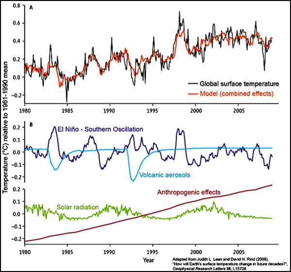
Let's take a look at a very simple model consisting of only four variables over the last 30 years (Spencer Weart, American Geophysical Union). Shown in the lower part of the graph at the left are the key variables affecting the climate: temperature variations from the sun (green), volcanic aerosol temperature variations (light blue), El Niño temperature variations (purple), and Anthropogenic (human caused greenhouse gas) temperature effects (maroon).
In climate scientific literature, these external climate effects are called "forcings". A forcing is an indicator of the importance of a given factor in altering the balance of incoming and outgoing energy of the earth. A positive forcing warms the earth while a negative forcing cools it. For example, the solar radiation effect from the sun is called the "sun's forcing" and is positive. A volcano's forcing is negative.
In the top part of the graph, the black line is the historical average global surface temperature. The orange line is the results of the combined four "forcings" when added together. As one can see, the model fits the historical average quite well. However, when going forward assumptions have to be made about the four forcings. This is where the conversation gets interesting.
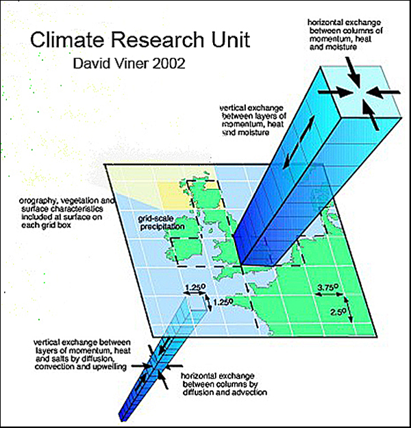
General Circulation Models (GCMs) developed by the climate research community are much more complex than the one presented above. GMCs forecast the climate using a three dimensional grid over the globe. The squares of the grid at the surface typically range from 150 to 350 miles per side. They have between 10 to 20 vertical layers in the atmosphere and up to 30 layers in the oceans. So a column unit over an ocean might consist of 50 layers of cubes, one on top of another like a narrow upside down pyramid with no point at the bottom. See the illustration at the left. The surface of each cube mathematically interacts with each surrounding surface that it touches. Thus the models can dynamically model the movement of air and water currents in all directions as well as temperature gradients. These models are enormously complex and consume tons of computer time.
While it is hard not to appreciate the sophistication of these models, only other climate experts can make judgments about their usefulness. Lay people must have blind faith in the modelers to believe their forecasts and as a result there are quite a few skeptics.
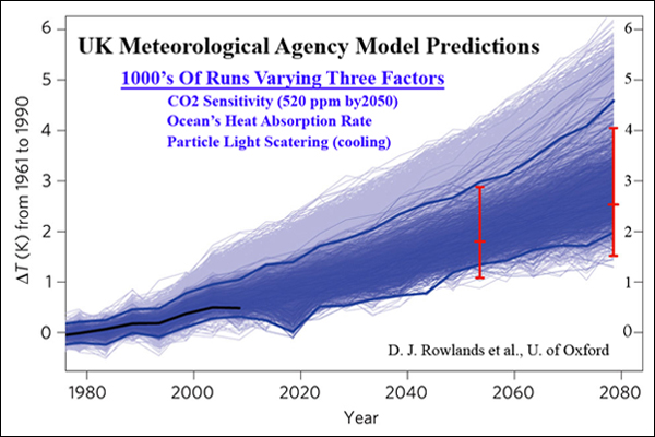
Simple models were first developed in the 1960s and by the early 2000s the models had become extremely sophisticated. The chart to the left is from a model developed by the UK Meteorological Agency (The Met) whereby D. J. Rowlands et al. did thousands of simulations varying just three variables - various CO2 sensitivities to an increase in the CO2 content to 520 ppm by 2050, the ocean's heat absorption rates, and light scattering rates from fine particles (aerosols) in the atmosphere.
Each light blue line represents one run with a specific set of variables. The dark area depicts the most likely results. The authors suggest the global climate in 2050 will most likely be between 1.6°C and 3.0°C warmer than the average from 1960 to 1990. This is somewhat warmer than previous projections, but typical of most models. Just about every model predicts more warming in the 21st century than that of the last century (0.6°C). The IPPC 4th Assessment predicts a warming of 2.8°C with a range of 1.7°C to 4.4°C for the most reasonable humanistic scenario (IPPC scenario A1B). The models appear to be very good approximations of the real world and are improving all the time. However, skeptics feel that most of the models are fed "positive forcing" parameters that are too aggressive.
The one criticism of the climate modeling community that stands out is the fact that they seem to be obsessed with proving "model verification". This appears to outsiders to be a case of self-glorification. Science should be the objective pursuit of the truth, regardless of the path it takes. Top
BEST - A Non-Model Approach
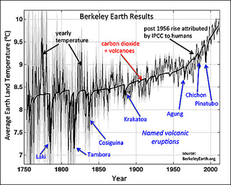
Richard A. Muller is a professor of physics at the U. of California, Berkeley. Muller founded the Berkeley Earth Surface Temperature (BEST) project with his daughter Elizabeth Muller. With a huge effort involving a dozen scientists BEST generated a new global "land" temperature estimate for the past 250 years. This project complemented only three other similar research studies ever completed. The results of the study are shown in the chart at the left which also indicates major volcano activity. Volcano activity dominates various cooling periods. This study confirmed the three other reports as being basically correct. Global warming is real, but modest.
Muller has been an outspoken critic of climate models. In an article in the New York Times July 28, 2012 he said "Our analysis does not depend on large, complex global climate models, the huge computer programs that are notorious for their hidden assumptions and adjustable parameters. Our result is based simply on the close agreement between the shape of the observed temperature rise and the known greenhouse gas increase. It’s a scientist’s duty to be properly skeptical. I still find that much, if not most, of what is attributed to climate change is speculative, exaggerated or just plain wrong."
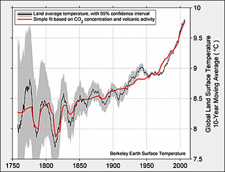
Instead of using a model approach, Muller used advanced statistical techniques to determine good variable correlation. For example, in the chart to the left, BEST used only CO2 and volcanic activity to make the red line which matches the actual temperature plot quite well.
Notably absent are effects from the sun and oceans. Having incorporated solar effects and ocean variances, the improvements in correlation were negligible. "Our record is long enough that we could search for the fingerprint of solar variability, based on the historical record of sunspots. That fingerprint is absent."
Methane also showed no correlation improvement. The one variable that really mattered was CO2. The good CO2 correlation does not prove causality, but it does raise the bar as no other variable was close.
As far as projecting the future is concerned, Muller says "I expect the rate of warming to proceed at a steady pace, about one and a half degrees Fahrenheit over land in the next 50 years, less if the oceans are included. But if China continues its rapid economic growth (it has averaged 10 percent per year over the last 20 years) and its vast use of coal (it typically adds one new giga-watt per month), then that same warming could take place in less than 20 years. Top
A Disturbing Climate Change Discovery

Days were strange at the beginning of the age of mammals about 50 million years ago. The planet was still hungover from the disappearance of the dinosaurs. Fifty foot long boa snakes slid through steam bath jungles. Birds grew gigantic in imitation of their dearly departed cousins. Very small mammals that we might have to squint to recognize appeared.
But the most striking feature of this early age of mammals is that it was unbelievably hot and there were lush jungles everywhere. It was so hot that there were crocodiles, palm trees, and sand tiger sharks in the Arctic Circle. On the other side of the world that today surrounds Antarctica, sea-surface temperatures probably topped 85 degrees Fahrenheit, with tropical forests on Antarctica itself.
This is what you get in an ancient atmosphere with around 1,000 parts per million (ppm) of carbon dioxide. If this number sounds familiar, 1,000 ppm of CO2 is about what humanity is on pace to reach by the end of this century. It certainly should be concerning.
“You put more CO2 in the atmosphere and you get more warming, that’s just simple physics that we figured out in the 19th century,” says David Naafs, an organic geochemist at the University of Bristol. “But exactly how much it will warm by the end of the century, we don’t know. Based on our research of these ancient climates, though, it’s probably a lot more than we thought.”
Naafs’ team studied examples of low-quality coals called lignites. They had been collected around the world (everywhere from open-pit coal mines in Germany to outcrops in New Zealand), and spanned the late-Paleocene and early-Eocene epochs, i.e. from about 56 to 48 million years ago. They were able to reverse engineer the ancient climate by analyzing temperature-sensitive structures of lipids produced by fossil bacteria living in those bygone wetlands and preserved for all time in the coal. The team found that under this regime of high CO2, life endured "average" annual temperatures of 10 to 15 degrees Celsius (18 to 27 degrees Fahrenheit) warmer than modern times.“The wetlands looked exactly how only tropical wetlands look at present, like the Everglades or the Amazon,” Naafs says. “So Europe would look like the Everglades and a heat wave like that currently being experienced in Europe would be completely normal. It would be the everyday climate.”
“Perhaps a heat wave in Europe would be something like 40 degrees Celsius (104 degrees Fahrenheit)". So that was life in the late Paleocene and early Eocene in the high mid-latitudes. But closer to the equator, the heat might have been even more outrageous, shattering the limits of complex life. To see exactly how hot, Naafs’ team analyzed ancient lignite samples from India, which would have been in the tropics at the time. But unfortunately, the temperatures from these samples were maxed out. That is, they were too hot for his team to measure by the new methods they had developed. So it remains an open question just how infernal the tropics became in the early days of our ancestors.
There is a disconnect between traditional projections for future warming - like those made by the International Panel on Climate Change (IPCC), which predict around 4 degrees Celsius (7 degrees Fahrenheit) of warming by the end of the century under a business-as-usual emissions projection including a sea-level rise measured in mere inches with "CO2 conditions similar to 50 million years ago" - and the scarcely recognizable climate buried in the rocks created under a similar CO2 scenario. The changes that we’ve already set in motion will take millennia to fully unfold. The last time CO2 was at 400 ppm (as it is today) was 3 million years ago during the Pliocene epoch, when sea levels were perhaps 80 feet higher than today. Clearly the climate is not yet at equilibrium for a 400-ppm world.
Unfortunately, we don't seem to be content to stop at just 400 ppm. If we do in fact push CO2 up to around 1,000 ppm by the end of the century, the warming will persist and the earth will continue to change for what (to humans) is a practical eternity. And when the earth system finally does arrive at its equilibrium, it will most likely be in a climate state with no analog in the short history of man. Most worryingly, the climate models that we depend on to predict our future have largely failed to predict our ancient past. And though the models are catching up, even those that come close to reproducing the hothouse of the early Eocene, require injecting 16 times the modern level of CO2 into the air to achieve it - far beyond the meager doubling or tripling of CO2 indicated by the actual rock record.
Clearly our models are missing something, and Naafs thinks that one of the missing ingredients in the models is methane, a powerful greenhouse gas which might help close the divide between model worlds and fossil worlds. “We know nothing about the methane cycle during these greenhouse periods,” he says. “We know the hotter it gets the more methane comes out of these wetlands, but we know nothing about the methane cycle beyond the reach of ice cores which only go back 800,000 years. We know tropical wetlands pump much more methane into the atmosphere compared to cooler wetlands. And we know methane can actually amplify high-latitude warming, so maybe that’s the missing feedback.”
“Basically every type of paleoclimate research that’s being done shows that high CO2 means that it gets very warm. And when it gets very warm, it can get really, really, really warm” says David Naafs.
Top