
"Climate Change" Introduction
As we shall see below, the earth is in a temperature "increasing" portion of a climate cycle that has been going on for thousands of years. However, the rise has been very modest recently. In the 100 years from 1900 to 2000, the average global temperature increased only 1.1°F and hardly anyone noticed. Generally global warming may have some negative effects, but our concern should be focused on climate " large scale local change". As NASA states it "The real threat may not be the gradual rise in global temperature and sea level, but the redistribution of heat over the earth's surface. Some spots will warm, while others will cool. These changes, and the accompanying shifts in rainfall patterns, could relocate agricultural regions across the planet". It is the "redistribution" of climate (i.e. large scale local climate changes) that should be the focus of our concern.
The Vostok Project
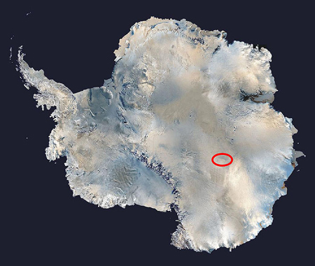
So, let us begin the discussion about "climate change" by looking at the big picture using historical data and try to "bound" the limits of temperature change by investigating what historically has happened in the past. The Vostok project is located on a mountain of glacial ice in East Antarctica about 800 miles from the South Pole as shown in the picture at the left. East Antarctica is a huge mountainous area about the size of Australia completely covered by very thick ice and very cold, no summer melting. About 70% of the earth's fresh water is stored as ice in East Antarctica. West Antarctica is rather flat (the section to the left in the photo), ice does melt in the summer, and Penguins inhabit the area.
In the early 1970s Russia began drilling ice cores at Vostok to study ancient temperatures, carbon dioxide atmospheric amounts, dust and other items of climatological interest. (Greenland ice cores cannot be used to study changes in carbon dioxide concentrations because there is too much dust in Greenland ice which decomposes and releases non-atmospheric carbon dioxide into the ice.)
Vostok station is about 11,400 feet above sea level and has been manned year round since 1957. In 1974 it was discovered that there was a very large freshwater lake deep down beneath the ice, but this was not published until 1993.
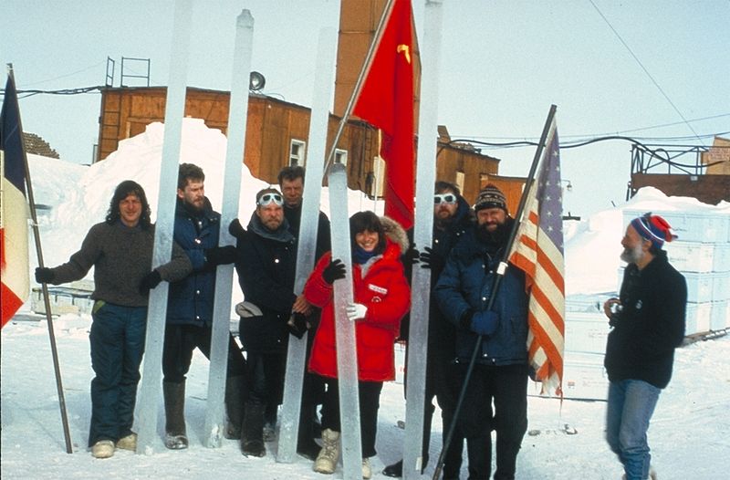
The lake is one of the largest lakes in he world. In the late 1980s French Scientists joined the expedition and a bit later so did American scientists. See the picture at the left.
Ice cores, also in the same picture, are rods of ice about 5 inches (13 centimeters) in diameter that have been "mined" from more than 300 feet deep in the ice. The first 300 feet are not usable and are usually just frozen snow contaminated by surface air. Also the very bottom of the core is frozen ice from the waters of Lake Vostok which contains no climate information. The data is considered valid down to a depth of 12,000 feet (about 2.3 miles).
Upper cores can be dated exactly by counting individual layers, each representing a year. These layers may be visible or they may be chemical, or they may be isotopic reflecting annual temperatures (for example, snow from colder periods has less of the heavier isotopes of hydrogen and oxygen). Deeper into the core the layers thin out due to ice flow and high pressure, and eventually individual years cannot be distinguished.
In 1996 Hole 5G reached a depth of 11,900 feet and was terminated by request of the Scientific Committee on Antarctic Research that expressed concerns about the possible contamination of Lake Vostok from the drilling fluids. In 1999 the final Vostok findings were published giving the world a climate history of 420,000 years. In February 2012, scientists were allowed to continue drilling using refined techniques and reached the surface of the lake at a depth of 12,365 feet. Top
Vostok Temperature & Carbon Dioxide (CO2) Data
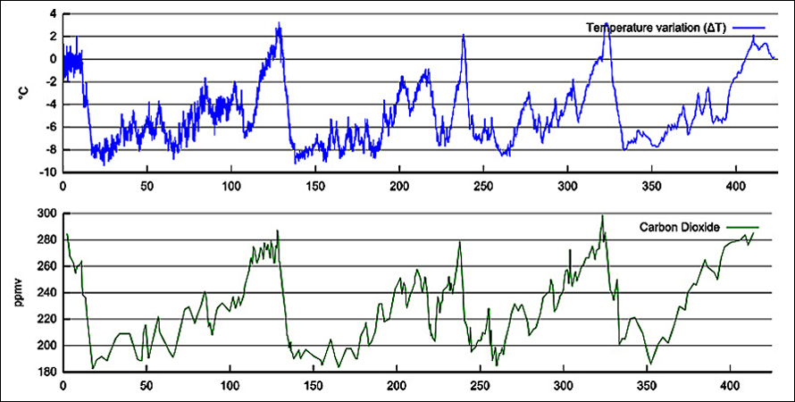
The above charts, published in June of 1999 by J. R. Petit et al, are very famous. The time axis on the bottom is in thousands of years, i.e. 50 stands for 50,000 years ago. As one can readily see, there are 5 peaks encompassing 4 major cycles over a 420,000 year period. On average a cycle lasts a little over 100,000 years. The top temperature chart shows the climate change (delta t) from an average reference point of 0°C which is 57.7°F in real terms. Because the time scales are shrunk to such a small scale, the temperature and carbon dioxide (CO2) cycles appear to be in synch. However, if examined on a much wider scale (not shown here), the temperatures lead the CO2 curves by about 600 years. This is an important point - temperatures lead CO2, not vice versa. Also an important point to note is that the CO2 levels never exceeded 300 parts per million in volume (ppmv). These points will be important in later discussions.
The main take-aways from the above charts are:
- The peak temperature delta (deviation from average) is 2 to 3°C (63.1°F), repeated 5 times.
- The low temperature delta is -8 to -9°C (41.5°F), repeated 4 times.
- The average temperature cycle range was 12°C or 22°F, almost exactly for each of the 4 cycles.
- CO2 levels never exceed 300 parts per million in volume (ppmv) - very important.
- Temperatures lead CO2 (not vice versa) indicating CO2 is a climate follower (but an important climate contributor nevertheless).
We could easily live with a high average temp of 63°F, but a 42°F average low temperature would be brutal (ice age stuff). For an update on current Antarctic ice conditions click here. Top
1.000 Years Of Temperatures
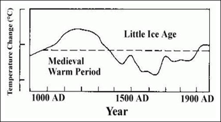
In 1990 the IPPC in its first report, Climate Change The IPCC Scientific Assessment, released the temperature chart at the left (Figure 7c, page 202). There are two periods portrayed in the chart - the Medieval Warm Period and the Little Ice Age. The thing that hardly anyone ever mentions is the fact that the Medieval Warm Period was possibly warmer than the temperatures of today, at least in England as the world averages were not known then. Although the Y-axis is not labeled, it is +1°C and - 1°C at the hash marks.
In the same report the following significant point was made "This period of widespread warmth (the Medieval Period) is notable in that there is no evidence that it was accompanied by an increase of greenhouse gases." If there was no increase in CO2, then presumably the sun's effects (what else could there be) were responsible for the temperature increase. Also note that the "Little Ice Age" followed and lasted for about 300 years. Top
Industrial Age Temperatures Increase
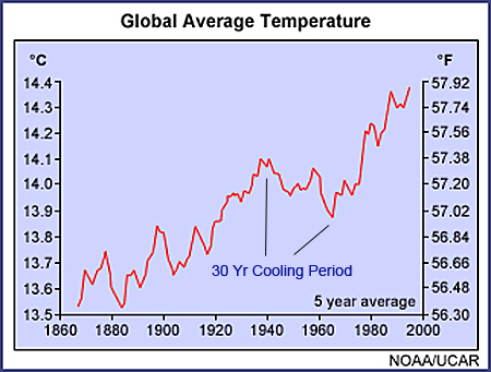
As shown in the NOAA (National Oceanic and Atmospheric Administration) chart at the left, the 5 year average temperature rise (land and sea) from 1901 to 2000 has been 0.6°C (or 1.1°F). Just about everyone agrees that in the last millennium (1901 to 2000) our global temperatures have risen a modest amount - 0.2% - as measured scientifically using a Kelvin scale of a low of 286.7 (56.6°F) to a high of 287.3 (57.7°F).
So global warming is very real, but modest. The question then becomes "is the cause of global warming a natural one caused by the sun, orbit of the earth, other natural causes or is it man-made by the burning of fossil fuels, etc."
The second question is "in the next millennium will the rise in temperatures be the same as the last millennium or will temperatures accelerate as most climatologists predict?".
Note that from 1940 to 1970, a 30 year time frame, there was a mini cooling period, but then the heating trend resumed. In the last 50 years from 1961 to 2010 temperatures rose 0.55°C, almost as much as the the amount from 1900 to 2000 (0.60°C).
Are Temperatures Accelerating?
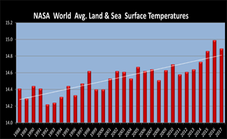
The 30 year chart at the left was created from data released in November, 2018 by NASA at the Goddard Institute for Space Studies (GISS). The yearly averages in degrees C were calculated based on readings from a huge number of surface measuring stations both on land and sea from around the world. While the chart shows some fluctuations, note the very fine temperature scale. The data low point is 14.22°C and the high point is 14.99°C. This is a maximum fluctuation of 0.77°C, or 1.4 degrees Fahrenheit over 30 years. 14.0°C was the average temperature from 1951 to 1980 and is considered the "base-line" average that NASA uses for comparison purposes.
The "white average" 30 year trend line shows a difference of 0.55 degrees C or 1.0 degree Fahrenheit between 1988 and 2017. So, there has been a noticeable increase in the average world temperature since 1988. If this rate of change were to be extrapolated to 100 years, the increase would be 3.3 degrees F, triple the 1.1 degree F increase from 1900 to 2000. Based on this NASA data, the fact that world wide climate warming is accelerating is confirmed. Top
Sea Levels Are Also Rising
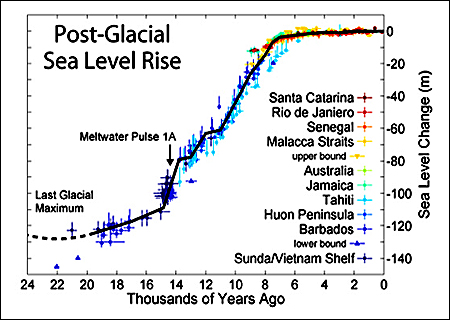
Sea levels have also been rising for a very long time. As the chart on the left shows, sea levels have risen a great deal over the last 22,000 years since the "Last Glacial Maximum". However, they have been rising very modestly for the last 5,000 years. About 22,000 years ago during the last major ice age, sea levels were about 400 feet (130 meters) lower than today. It was at this time that people from northern Asia began to migrate into North America across the Bering Land Bridge. Back then there was a dry land connection above the seas that enabled them to do so. Even today the seas are only about 50 feet deep in the Bering Strait. Check out a 21,000 year sea level animation of the Bering Strait.
As the glaciers melted, the liquid water eventually made its way to the oceans. Also because water temperatures were rising, this caused the water itself to expand. Water is no different than any other element. As the temperature of any element increases, the element expands. As temperatures rise, 60% of the increase in sea levels is caused by water expansion. The other 40% increase is due to run off from the glaciers.
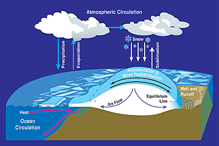
There is constant circulation between a glacier, the oceans, and the atmosphere as the sketch to the left illustrates. Ice normally flows from the center of the ice sheet to the edges. It is quite normal for it to melt somewhat at the edges in the summer, break up into icebergs, and float off into the main ocean. The edges of an iceberg tend to "hang over" the warmer ocean. Eventually they break off and float away, this is called "calving". Glaciers calve icebergs every summer.
However, in winter snow falls on the glacier, gets packed, and eventually turns to ice. Glaciers grow in winter and shrink in summer. It is hard to tell if a glacier has a net gain or a net loss in the short run because of varying local weather conditions. However, they can be measured over the long run. Glaciers can be up to 2 miles high, and if already on top of a land mountain, they can grow up to 4 miles above sea levels. The tall mountain glaciers never melt as they are too cold all the time at their heights.
Although it is now hard for us to imagine, the Rocky Mountains had ancient glaciers that were about 2 miles thick on top of the already tall mountains. The ice sheet was so tall that it did not melt in the summer. However as global temperatures rose, at a critical point the glaciers began to melt year round and caused a rapid increase in sea levels between 18,000 and 8,000 years ago as shown in the Post-Glacial Chart at the upper left.
On the other side of the coin, about 120,000 years ago, the seas were higher than they are today by about 20 feet as recorded on wave notched cliffs in the Bahamas. So the rising and falling of sea levels is not new, this has been going on for thousands and thousands of years. This all came about because of nature, before man was capable of influencing her.
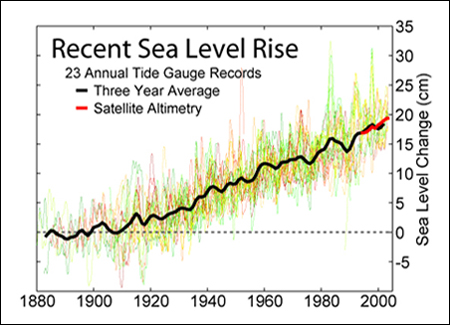
From data accumulated over the last 100 years from 23 tide gauges averaged around the world (black line shown at the left) we can see that global sea levels rose by 19 cm (7.5 inches). Using modern GPS satellite measurements, scientists have determined that sea rise has accelerated to 3.2 mm per year over the last 20 years from a rate of 0.8 mm per year from 1870 to 1920. If the seas should rise about 24 to 36 inches over the next 100 years, it will definitely affect some low lying regions, displace millions of people, and cost a lot of money to adjust, but by in large, humans will adapt to the further rise of sea levels. Top
The Greenhouse Effect
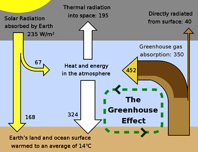
The chart at the left is the basic Greenhouse Effect diagram. The real world is a bit more complicated, but this chart demonstrates the basic principles. At the top of the diagram (gray area) one can see that the average location on earth "absorbs" on average 235 watts per square meter (w/m2) of sunlight energy (more at the equator, much less at the poles). Also notice in the middle and on the right side of the gray area that the earth returns to outer space 195 w/m2 of thermal radiation and 40 w/m2 of direct radiation which also total 235 w/m2. Thus in this diagram the earth is in "thermal equilibrium", i.e. it radiates back as much heat as it absorbs.
Greenhouse gases form an invisible layer that traps heat and then re-radiates it in all directions. They are called "greenhouse gases" because they hold heat in, like the glass ceilings of a greenhouse. The greenhouse gases are water vapor (H2O, 36% to 70%), carbon dioxide (CO2, 9% to 26%), methane (CH4, 4% to 9%), ozone (O3, 3% to 7%) and a few other minor gases. The other non-gas major contributor to the greenhouse effect, clouds, absorb and emit infrared radiation and have a large effect on the radiative properties of the atmosphere. In the chart above, if you take the 452 watts (really w/m2) of energy coming up from the earth and add to it the 67 watts absorbed by the atmosphere from incoming waves, you get a total of 519 watts to be dispersed. 324 of the 519 watts are returned to earth and the balance of 195 is radiated into deep space completing the cycle. For more detailed information about the Greenhouse Effect and the Earth's Radiation Budget click here.
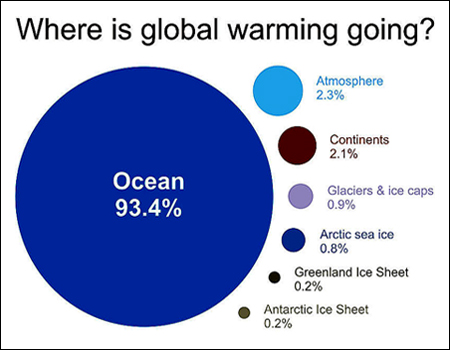
Recent measurements indicate that the earth is presently absorbing 0.58 ± 0.15 w/m2 more heat than it emits back into space. Where does this excess heat go? As the chart to the left indicates, almost all of it (93.4%) is absorbed by the oceans. The oceans play a very significant role as our climate changes.
If the only source of heat had been the incoming sun's energy, the average temperature at the earth's surface would be -0.4°F, roughly "zero" °F. However, the actual average temperature is +57.7°F (+14.3°C). The difference of +58°F (+32°C) is due to the Greenhouse Effect and makes life here on earth much more enjoyable. Naturally occurring greenhouse gases are a very good thing and make life as we know it very livable!
Atmospheric scientists first used the term Greenhouse Effect in the early 1800s. At that time, it was used to describe the naturally occurring functions of trace gases in the atmosphere and had only good connotations, no negative ones. It was not until the mid 1950s that the term Greenhouse Effect was coupled with concern over climate change. The negative concerns are related to the possible impacts of an enhanced "man-made" Greenhouse Effect. Top
Carbon Dioxide Effects
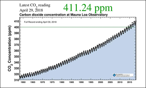
An overwhelming majority of climate scientists believe that the excess energy being absorbed by the earth is being caused by human emissions of greenhouse gases and in particular carbon dioxide (CO2). Carbon dioxide accounted for 411 parts per million volume (ppmv) of the earth's atmosphere as of April, 2018, having increased from 280 ppmv in the 1830's. See the chart a the left from Mauna Loa, Hawaii showing the yearly increases in CO2. Remember that during the Vostok era of 420,000 years the CO2 levels never exceeded 300 ppmv. One can see that there is also an annual cycle to the CO2 Chart. In the spring and summer plants consume CO2 (total CO2 decreases) while in the fall and winter plants are quiet and humans increase CO2 more each year.
The IPCC has stated that: "Greenhouse gases, largely the result of human activities, has very likely (90% probability) caused most of the observed global warming over the last 50 years". There is no question that the amount of CO2 in the atmosphere is increasing and is strongly correlated with increasing temperature. The question is "whether the increase of CO2 is causing the warming trend or is the warming trend causing the increase in CO2".
Only a very small portion of our atmosphere is CO2 - 0.039% (4/100 of 1%). Does the increase of 0.01% really make a difference in the climate? A majority of climate scientists in the world think the answer to that question is "yes". As mentioned above, carbon dioxide is a greenhouse gas. Because the proportion of greenhouse gases in the atmosphere is so very low, human greenhouse emissions can have a significant effect. The burning of fossil fuel for transportation, electricity, etc. and the destruction of our rain forests have increased the amount of CO2 in the atmosphere. Climate scientists have produced dynamic models of the atmosphere and these models predict that the continuing increase of CO2 will cause "accelerated" warming of the planet.
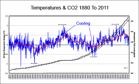
However, there is one piece of information that is disturbing to the CO2 cause and effect argument. If one looks at the CRU (Climatic Research Unit) temperature chart to the left (blue line) versus the CO2 dots, one can see that from 1940 to 1970, a 30 year time frame, there was a distinct mini cooling period in spite of the fact that CO2 was rising during this time. CO2 climate skeptics use this period as evidence that CO2 may not be the primary driver of global warming as it does not correlate well with the cooling temperatures during this 30 year period.
So, at times the sun dominates the climate and at other times there is evidence that greenhouse gases dominate. The truth is - both are heavily involved but are not synchronized. In addition to the sun and greenhouse gases, volcanoes play a major role whenever they erupt. Also, the great ocean current - the El Niño Southern Oscillation (ENSO) at times contributes significantly to the global climate. For more ocean climate information see the El Niño section. Also, there is a good explanation by the EPA (Environmental Protection Agency) of the causes of climate change here. Top
US CO2 Emissions Are Down
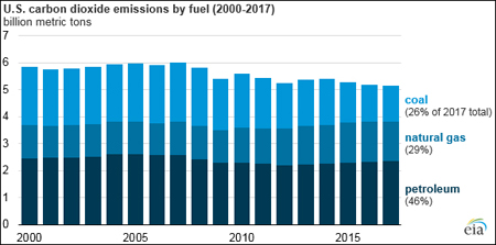
Although CO2 emissions world wide continue to climb, the US contribution is down as shown in the chart at the left from the US Energy Information Administration (EIA). 2017 CO2 emissions from energy consumption are down 14% from the 2005 peak.
U.S. energy-related carbon dioxide (CO2) emissions in 2017 fell to 5.14 billion metric tons, 0.9% lower than their 2016 levels, and coal emissions were the primary reason behind the decline. U.S. energy-related CO2 emissions have declined in 7 of the past 10 years, and they are now 14% lower than in 2005.
Both coal and natural gas consumption in the United States were lower in 2017 than in 2016, and as a result, coal and natural gas related CO2 emissions decreased 2.6% and 1.5%, respectively. Natural gas consumption has displaced coal consumption in the electric power sector in recent years. Total U.S. emissions from natural gas first surpassed emissions from coal in 2015. U.S. petroleum consumption increased in 2017, contributing to a 0.5% increase in energy-related CO2 emissions from petroleum, but this increase was offset by the decrease in coal and natural gas emissions
While conservation and greater use of renewable energy are factors in the CO2 decline, the drop off is due mainly to low cost natural gas. Successful natural gas drilling in the US has caused the wholesale price to plummet from $8 per unit to about $2, making it cheaper to burn than coal for a given amount of energy. Therefore, utilities are relying more than ever on natural gas generating plants. The boom in gas production has come from hydraulic fracturing or "fracking" in the northeast US and the Texas area. Large volumes of water, sand and chemicals are injected into the earth under high pressure to break up shale rock and free the trapped natural gas which is mostly methane. Top
US Climate Boundary Line Is Moving Eastward
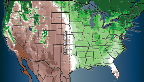
Traveling westward across the US one experiences hardwood trees giving way to shrubs, vibrant cornfields going to brown wheat and lush grasslands becoming creosote bush. The air dries out and the land is often parched. This rather abrupt shift from the humid east to the arid west occurs along a border that slices neatly from Canada to eastern Mexico. The divide is so stark that airline passengers can see a patchwork quilt of green farms on one side, and a vast expanse of brown and gold on the other.
The "100th meridian" (the solid north-south line in the map to the left) coincides with the "climate divide" between the relatively moist eastern US and the more arid West since the mid 1800s. Climate change has been pushing the current divide eastward (the dotted line) and now it is close to the 98th meridian, some 100 miles east of the 100th.
Using climate models a team at Columbia University showed that rising temperatures will likely push the divide more to the east, as the parched western plains expand. Arid takeovers like this happen because rising temperatures enable the atmosphere to hold more moisture, thereby increasing evaporation from the soil. “It would be somewhat simplistic to just look at climate and say, ‘Oh, things are going to go to hell in a hand basket," Richard Seager, a climate scientist at Columbia says. “The agriculture field does not stay static. Adaptation does occur. Development does happen.” Top
The Carbon Footprint
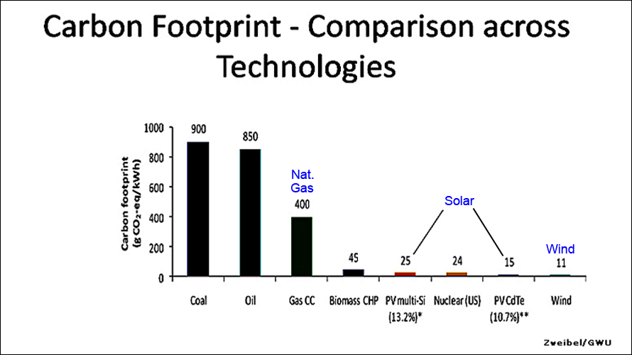
As can been seen from the above chart, natural gas is not a perfect solution for the carbon dioxide problem. However, because coal is so dirty and natural gas is so cheap, it provides an interim solution to the CO2 issue. Solar and wind, with only a few percentage points of the carbon emissions of coal, are probably the long term solutions but they will have to come down considerably in cost to be competitive with natural gas. However worldwide renewable energy support, in the form of incentives such as tax breaks and rebates, is keeping solar and wind power in the game. Top
Clouds And Cosmic Rays

When the IPPC says it is "very likely" (90% probability according to their published definitions) that human activity has caused most global warming, what is the remaining 10% probability of something else causing global warming? Actually the hesitation by the IPCC to say excess global warming is 100% due to human activity is because of the unknowns associated with clouds and cosmic rays. It is a quite well known fact that the sun's high internal activity causes increased solar wind, which decreases cosmic rays because of more particle collisions in outer space, which reduces cloud formation, which increases the sun's rays which get through to the earth, which then heats up our earthly temperatures. So how do cosmic rays create clouds?
When air is highly saturated with water vapor, the water's preferred phase is to be in the liquid state. However, in order for the water vapor to condense, it must have a solid surface to adhere to. This surface can be tiny dust particles, salt crystals, or other small particles (aerosols). In clean environments, like the middle of an ocean, the primary source of aerosols is nucleation, which is a process whereby new solid particles form from atmospheric gases. These newly created particles are just a few nanometers in size and must continue to grow through coagulation to several tens of nanometers before they can act as seeds for cloud formation.
Current climate computer models do not simulate the effect of cosmic rays and clouds very well as this process is not well understood at the atomic level. The correlation between cosmic rays and temperatures can explain about 2/3's of the variance in very long term global temperature history. Said differently, cosmic ray variability is the "dominant" climate driver over the many million-year time scales. CO2 and other variables make up only 1/3 of the climate variance. Nir Shaviv, professor of astrophysics at Hebrew University, Jerusalem believes that cosmic rays modulated by the sun's activities in today's environment account for 1/2 to 2/3's of the climate's variability. He concedes that humans are most likely responsible for the other 1/3 to 1/2. Click here for a more detailed section on Clouds and Cosmic Rays. Top
Is Global Warming Bad?

Balanced View. The author is striving to present a balanced view of Climate Change. Historically we are in a long term warming trend, there is no debate about that. The real questions are: whether or not mankind is accelerating it (almost certainly) and will mankind continue to accelerate it going forward (most likely). Whatever future temperatures turn out to be, we will no doubt have to deal with a warmer climate than today. Lets examine some of the the consequences of a warmer climate.
Warming Continues. For the sake of argument, let us assume that "global warming" continues at a modest pace such that by the year 2100 the average world temperature is 2°C to 3°C (3.6°F to 5.4°F) warmer than 2000. (IPPC's best estimate for the most likely scenario is 2.8°C or 5°F.) What will be the realistic affect on the planet?
Ecosystems Will Change. Almost all locations will warm. Some species will move further north and succeed; some will not be able to move and could become extinct. The changes in rainfall patterns could force some agriculture to shift to other locations on the planet. These relocations could be painful to a percentage of the world population of people and wildlife. But, we are confident humans and wildlife in general will find ways to survive and live a decent life.
Polar Bears. Polar bears (and other cold weather animals) were most likely in some version of their present form during the last warming age about 120,000 years ago when there was virtually no ice at the North Pole. The average Arctic temperatures at the time were 3 to 5°C (5.4 to 9.0°F) higher than present. Somehow the polar bears survived. In any case, the polar bear population needs to be monitored with respect to their adaptability and management systems put in place to guarantee their survival.
Rising Seas. If average global temperatures were to rise 2°C to 3°C we can expect sea levels to rise by 24 to36 inches by the year 2100. This would be a big increase over the rise of the last century of 7.5 inches. Ice is melting worldwide and especially at the poles. Melting includes mountain glaciers, the ice sheet covering Greenland and Western Antarctica, and Arctic sea ice. However it would take thousands of years to completely melt all the ice. The glaciers and ice sheets are melting mainly around the edges. There will be major damage to very low lying regions and countries. There is nothing mankind can do to prevent future sea level rises. Rising seas are part of nature. The seas have been rising for thousands of years and will continue for centuries into the future. If we act rapidly to reduce greenhouse emissions we can prevent the "worst effects" of rising seas. Switching reasonably quickly to renewable energy sources is the way to avoid the disastrous sea level rise.
Warming Is Better Than Cooling. The earth's long term climate is always changing, warming and then cooling. It is never steady for very long. Most professional scientists agree that if we have a choice, warmer climates are better than cooler ones.
So here are some items to consider:
All things being equal, whether it is a fish in the ocean, a shrimp in an pond, or a bean on a vine, it will grow faster when it is warmer rather than colder.
-
CO2 is not a pollutant but is the primary food of plants that feed animals and us. More crops are grown when it is warmer than when it is cooler. During the mini cooling period of the 1970's, agricultural experts worried about world wide food shortages. Greenhouses purposely increase their CO2 content to increase their crop production.
-
Measured rain precipitation rates increase between 5% and 10% for every degree C climate increase. (The expected rate of increase just based on thermodynamics is 7%.) The atmosphere definitely holds more moisture as temperatures increase, so overall there will be more rainfall. But, warmer temperatures also mean that ground evaporation is faster. Therefore, the increase in rain precipitation is not expected to be uniform - some areas will receive more rain and some may become drier. The outcome for any individual area will depend upon its local weather patterns.
-
If the warming trend conforms with the previous Vostok peaks, i.e. a 2°C rise, complete melting of the Greenland Ice Sheet would take 50,000 years. If in the long run global warming reached 8°C (6°C above the Vostok peaks), the complete melting of the Greenland Ice Sheet would take 2,000 years according to the latest models.
-
The Antarctic "sea" ice is growing! Since 1979 satellite images show that Antarctic sea ice has increased about 100,000 square kilometers per decade (about 0.6% growth per decade). Also the air temperatures over Antarctica have been "decreasing slightly". Scientists believe the ozone hole over Antarctica reduces the local effects of greenhouse gases. Click here for more Antarctica ice information.
-
The CLOUD Project at CERN is investigating the exact nature of how cosmic rays interact with the atmosphere to form clouds. The results of these experiments could have the potential to drastically change our perceptions about climate change.
A warmer climate would reduce the occurrence of cold temperature related illnesses, such as colds and flu. The likelihood of massive flu-like epidemics would be reduced.
When one part of the globe is warmer than usual, say the US in in the winter of 2011-2012, other parts of the world are undergoing extreme cold, i.e. Europe and Russia in 2011-2012. That is why it is necessary to use carefully computed world average temperatures when drawing conclusions about climate change.
After the unusual hurricane season of 2005 (Katrina, etc.), alarmists blamed climate warming for the disasters. The latest statement from the UN World Meteorological Organization (parent organization of IPCC) concluded that "no individual tropical hurricane can be directly attributed to climate change".
-
Humans will be quick to take advantage of a warmer climate in general and adjust accordingly as required in certain areas.
Summary. While it is not clear what the short term climate outlook will be, it seems likely that in the long term we will continue in the now centuries old modest warming trend. The negative effects of global warming have been grossly exaggerated by politicians, aggressive climatologists, and the media. The advantages of a warmer climate have been completely ignored and usually never mentioned. If the warming cycle is accelerating, we will just have to deal with it. Most objective scientists agree that the "net" effects of warming are positive.
We should continue to reduce greenhouse gases, and in particular carbon dioxide and other soot particles for many reasons including warming, health, sourcing of energy, and political stability. If we exert reasonable control over fossil fuel emissions, we will be able to live with the impacts from global warming.